1. Laurent HW
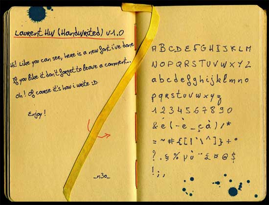
Characters in this typeface appear as though they have been written in fountain pen onto slightly absorbent paper. This gives the nostalgic impression of a school child’s scrawl in an exercise book.
2. Skinographie
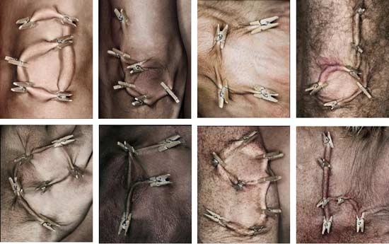
Skinographie is a typeface constructed solely from clothes pegs and skin. Pegs are applied to a human canvas in order to form an alphabet of lowercase letters. It’s certainly not the most attractive typeface in this list, in fact it’s rather disgusting, but never let it be said it’s not creative! While some letters like ‘I’, for example, can easily be recreated at home, others like ‘E’ can only be reproduced on people with high pain thresholds and exceptionally saggy skin. I’m not sure whether it’s possible to create punctuation marks using this method, but the very thought of it brings tears to my eyes.
3. Origram
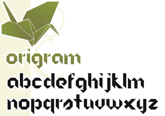
Inspired by origami, Origram is a simple, but very effective typeface with an obvious Asian influence. The strokes within each character end at a sharp point, as with folded paper.
4. Adry of Hanabi
This typeface is very reminiscent of European street art. Most of the characters incorporate a relaxed, spiral motif, which has a certain graffiti-like quality.
5. Ecofont
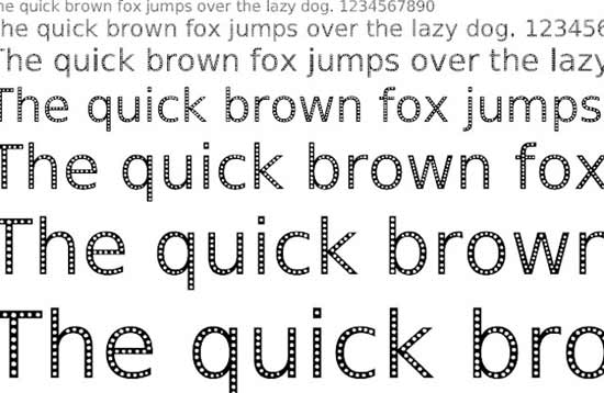
Most types of ink contain high levels of volatile organic compounds (VOCs), hazardous air pollutants (HAPs) and heavy metals, which are all environmentally degrading. Typographer Collin Willems has designed a typeface called Ecofont, which he hopes will reduce the amount of ink used in the printing industry and make it more sustainable.
Each Ecofont character contains a row of tiny circles, reducing its ‘weight’ and the amount of ink required to print it. Although Ecofont is not suitable for every application, it’s perfect for ‘throw-away printing’, which comprises the majority of printed output.
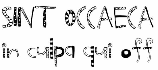
6. Sunday Morning Garage Sale
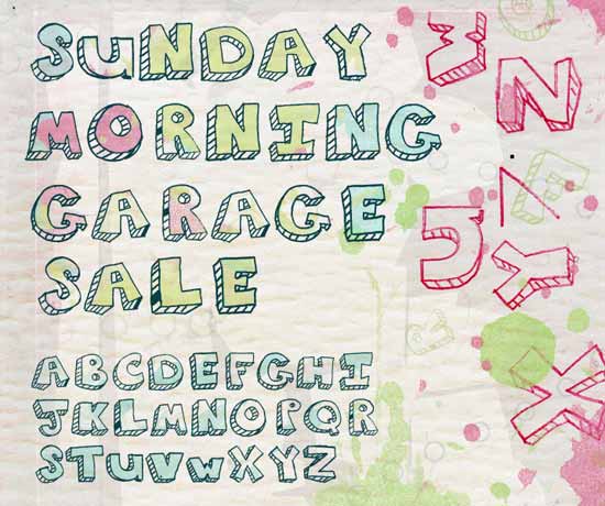
This cute typeface, which looks like its been based on a 13-year-old girl’s doodle, is both eye-catching and very fun. Its ‘messiness’ adds to its charm, but does not detract from its legibility.
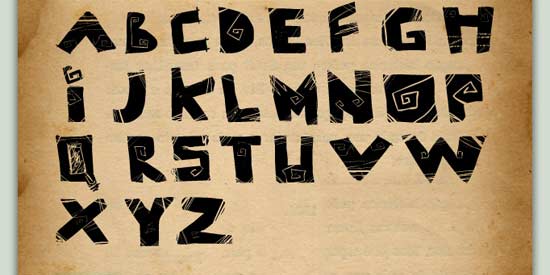
7. Pyramid

Each letter in this typeface has been designed as a pyramid, viewed from above. Not every character is as legible as it could or should be, but the design is extremely creative nonetheless.
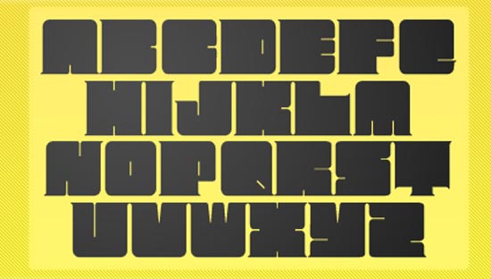
8. Megalopolis Extra
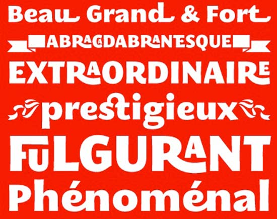
Designed by French font factory SMeltery, this bold typeface has some extremely creative ligatures. It’s at its best when it’s big and looks particularly striking when used on posters.
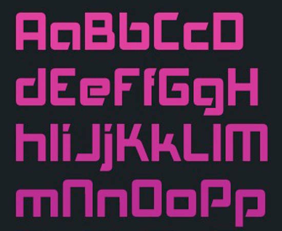
9. MOD
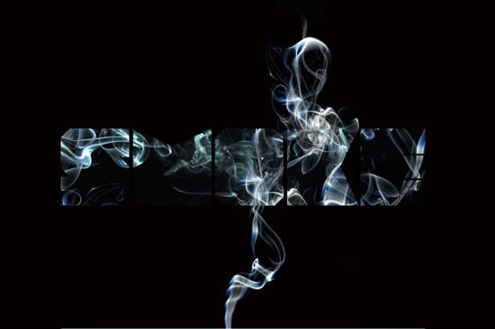
MOD is a font family consisting of variations on a theme of proportional, chunky, block characters. Some of these lack clarity, which is a shame, but the ones made from spilt milk and smoke spirals are highly imaginative.
10. Exus Pilot
This typeface is similar to MOD in many ways and is just as attractive. Unlike MOD however, it is a serif font, which really adds clarity and aids legibility.
11. Cube
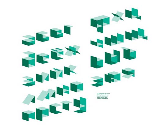
Cube is a gorgeous, 3-dimensional typeface, available in a range of vivid colours. It’s crisp, clear-cut and looks as though it’s been shaped from folded cardboard boxes.
12. LDJ Crafty
LDJ Crafty is a fun, hand-drawn typeface that would be perfect for use in media aimed at kids.
13. Plasti Puzzle Font
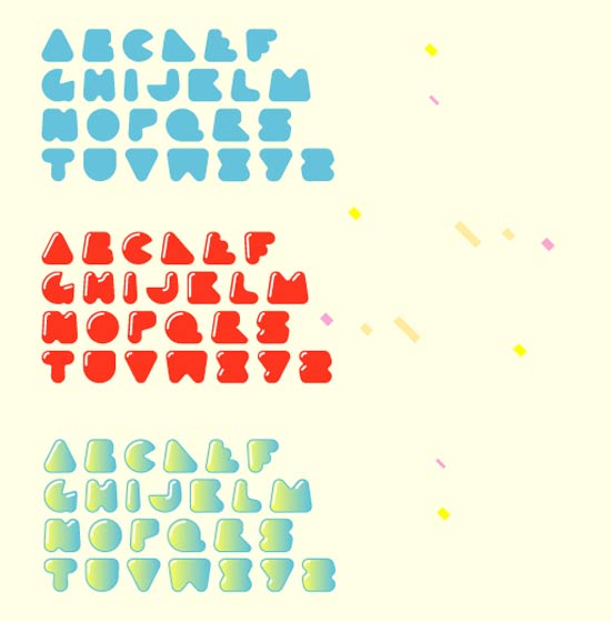
Plasti Puzzle was designed by Rodier-Kid, an extremely talented Argentinean graphic designer and typographer. Words written in this typeface are immediately intelligible, despite the cartoon-like, bubbly style.
14. Cinderella Decorative
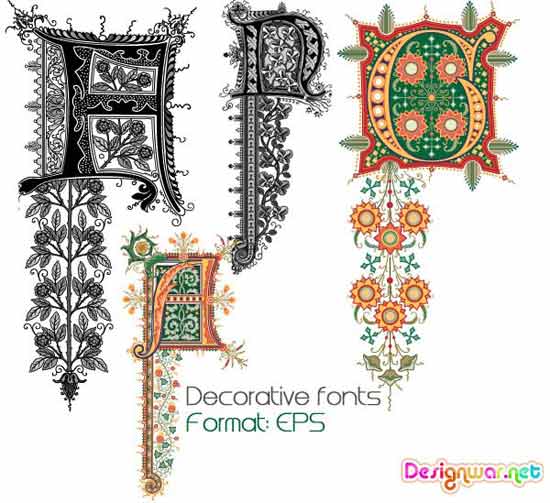
This beautifully embellished typeface is reminiscent of the illuminated calligraphy of the Middle Ages. Each character could be the first in an antique book of fairytales.
15. Sausage
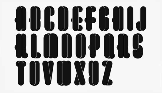
Sausage is an elongated, elegant typeface, which is inventive but comprehensible. The overlaying of ‘sausages’ to build characters creates an intriguing 3D effect.
16. Getting Blocky
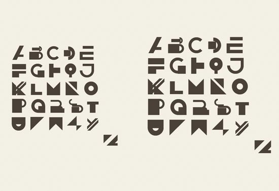
This highly original typeface looks great, but does suffer somewhat at the hands of its own stylisation. Some letters, particularly ‘R’, ‘N’, and ‘X’, look confusing on their own, although they do tend to work in sentence form.
17. Akashi
This cool typeface looks great on flyers for club night and other events. Each minimalist character has a rounded structure, while some end in a point, like Origram.
18. Contemporary

Contemporary is modern, lightweight and oozes style. The overlapping of characters is highly effective in this instance, although I personally think it would look more fluid if the ‘A’ and ‘V’ were less slanted.
19. Renaissance

Like Cinderella Decorative, this ornamental typeface owes much to illuminated calligraphy. Its detailed characters are interspersed with wildlife and angelic figures.
20. Dora
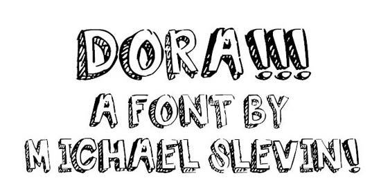
Dora is an example of how easy it is to make your own typeface. Michael Slevin simply scanned his friend Dora’s handwriting into a computer and made some minor adjustments. It looks slightly sketchy, but this could be his first step on the road to typographic greatness.